Partner: BUX UI team
UX Test Results: Website footer
In heat maps of websites, we sometimes see a cluster of dead clicks on the address in the footer. We believe people attempt to select and copy the address to get approximate location, probably for mapping or visiting.
Question and approach
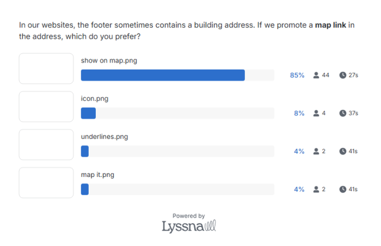
Experiment question: In our websites, the footer sometimes contains a building address. If we promote a map link in the address, which do you prefer?

Option 1: Add location pin icon next to address. Make it link to Google Maps.

Option 2: Add a separate link called "Map it" that links to Google Maps.

Option 3: Just add a hyperlink underline to the address.

Option 4: Scarlet "Show on map" link to Google Maps with icon.
51 people participated and gave us solid results
15 external panelists and 36 staff panelists responded to our question.
- Pin with “Show on Map” was a clear winner.
- 83% of the 15 external panelists answered “show on a Map was their preference.
- 84% of the 36 staff panelists answered “show on a Map was their preference.
- Two people mentioned the color in their comments. The scarlet color stood out, which was an afterthought, and may have skewed the results slightly.
- Next, we asked, “Which map would you prefer the link to open?”
Ohio State staff answered:
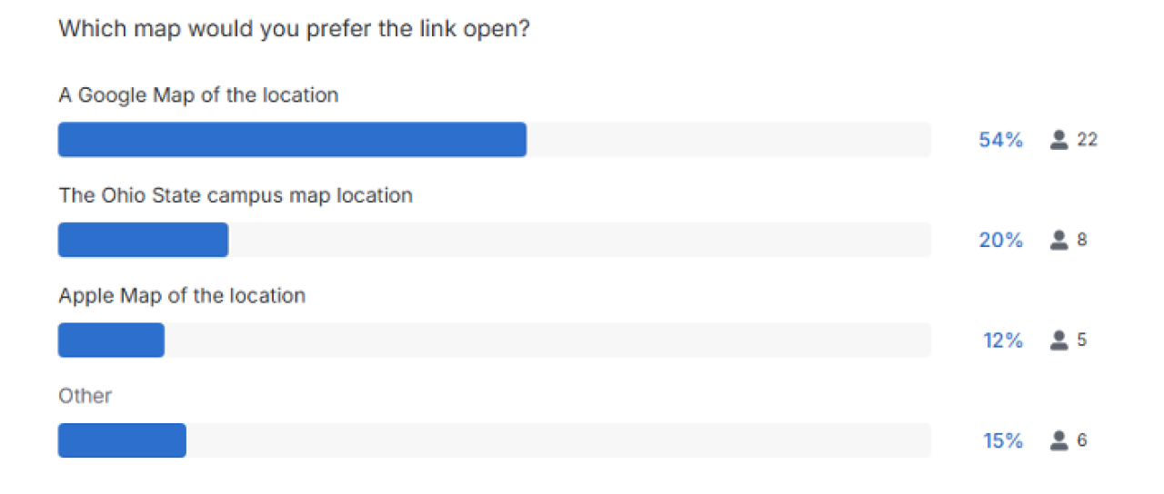
Overall answers were:
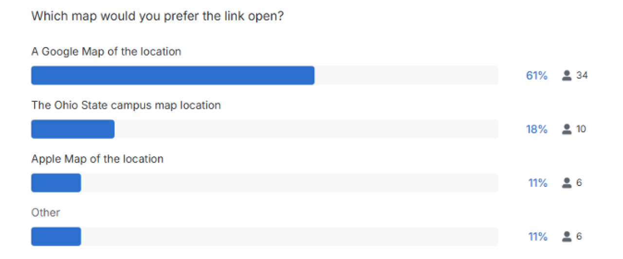
Google map locations are preferred by users so the most usable preferred option would be to use Google map pins.
Some participant comments
- I like there being the pin icon; having all three lines of the address underlined right above the underlined phone number and email makes reduces the emphasis of the text decoration and reduces legibility
- The separate icon, color, and text are together most likely to direct users where intended. As for which map service, on mobile it should query the device default.
- It might be nice to have the campus map open up as well.
- My only concern with this is if it is distinguishable for someone with color blindness. Perhaps make this a button?
- I think Google is the most universal
- I chose Google just because it's a more direct route to getting directions than the campus map, and while I'm an Apple user myself, I think Google is more ubiquitous.
- I think having the link red made it more noticeable.
- Just underlining or just showing the icon does not indicate that this is a link to open a map.
- I don't know an easy way to do this, but I wish this would go to the OSU map but then still have a way to jump to Google/Apple Maps for GPS navigation
- The first option with only the location icon was a very close second.
Experiment dates: 5/4 – 5/5/2026
Link destination expectations
We also asked users about expectations: “Which map would you prefer the link open?”
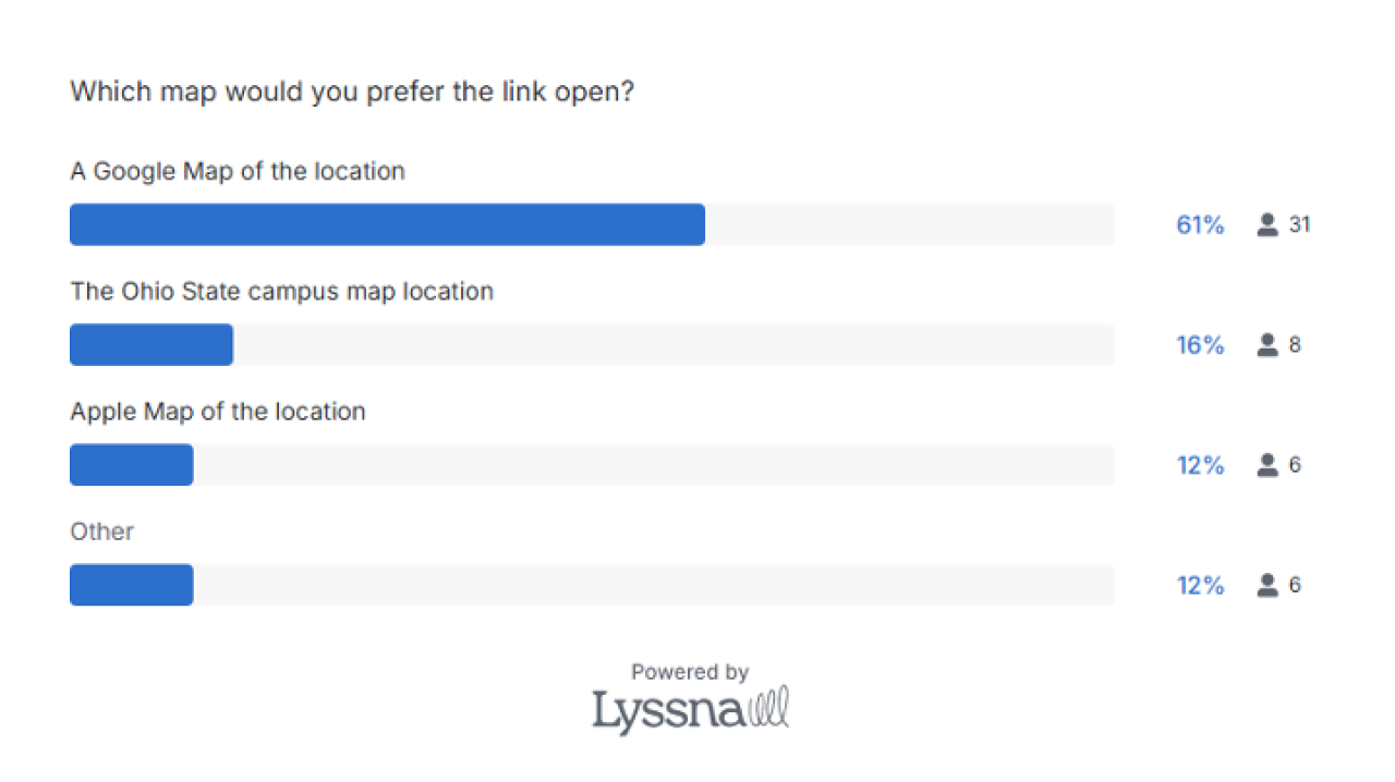
Google Maps are more widely expected/preferred, but supporting Ohio State campus maps was the team decision. Even with data, you can make decisions that align to your business goals.
“Other” answers respondents gave:
- Copy address to use preferred mapping
- If you can give the user (especially on a phone) the choice, that would be best, if not - then the OSU Campus Map with maybe some links to Google.
- Is it possible to have the user choose their recommended app? I would say ohio state app if they are using a phone
- Waze
Reach us to see if an experiment can help you pursue your web goals at userexperience@osu.edu
This page last updated 6/5/2026.